ELCI: How the Score Works
ELCI (the Expected Lifetime Comfort Index) is a single 0-100 number that summarizes how a retirement plan performs across 1,000 fully simulated lives. This paper explains what is actually computed, why it is built this way, how the models behind it are checked, and what the score cannot tell you.
One number with a precise definition
ELCI is not an impression, a letter grade, or a weighted checklist. It is the output of a fixed computation: your plan is lived out 1,000 times, month by month, through 1,000 different combinations of market history and health history. Each simulated life is graded on whether the plan actually delivered the standard of living it promised, every grade feeds a single aggregation rule, and the result is the number on the dial. Nothing enters the score that did not happen in a simulated life, and the full distribution of those lives is laid out on the dashboard.
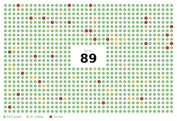
That traceability is the design promise. When the score says a plan is weaker than another, there is always a concrete answer to "weaker how?": some specific set of lives went badly, each one has a color, a cause, and a month-by-month record, and the arithmetic from those lives to the headline number is short enough to audit. The donut around the score and the score itself are reconciled to the same 1,000 lives by construction; the chart is not an illustration of the score, it is the score's raw material.
The score deliberately measures lived comfort, not terminal wealth. Money left over at death does not raise it, because the plan's own spending rules never allowed that surplus to be spent. A plan is judged on what it let you live on while you were alive, which is the thing a retirement plan is actually for.
Why not a probability of success
The standard industry output is a success rate: the percentage of simulations in which the portfolio never hits zero. We think that number answers the wrong question. It is binary, so a life that ran out of money at 93 counts the same as one that ran out at 71. It is blind to everything short of ruin, so a plan that forces twenty years of grinding cutbacks but technically never hits zero scores as a perfect success. And it tempts a false precision: "95% safe" reads as a guarantee rather than a model output.
ELCI replaces the binary with a graded verdict on every life. A life where essentials were always covered and the full discretionary budget was funded every month is different from one that got through on sustained belt-tightening, and both are different from one where the money for essentials ran out. The score distinguishes all of these, and it distinguishes mild squeezes from deep ones and brief ones from chronic ones.
This matters practically because most realistic plans fail softly before they fail hard. The interesting differences between two decent plans are rarely in the ruin count; they are in how often and how hard each plan has to cut back, and for whom. A one-dimensional success rate throws that information away. ELCI is built to keep it.
Three engines, one life
Each simulated life is the composition of three models. A market engine (we call it MarketPath) generates decades of monthly returns for stocks, bonds, inflation-protected bonds, and cash, along with inflation itself. It is a structural model, not a grab bag of returns: valuations, interest rates, earnings, and inflation regimes evolve together, so it can produce the things that break retirements, such as a 1970s-style stagflation that hurts stocks and bonds at once, a deep crash early in retirement, or a long stretch where high starting valuations deliver thin returns. And it is conditioned on today's actual rates, inflation, and valuations rather than starting every simulation from a neutral average world. Retiring into an expensive market is a different proposition from retiring into a cheap one, and the model knows which one you are in.
A health engine (LifePath) generates the human side: for each spouse, a monthly trajectory of functional ability, cognition, residence (community or institutional care), and ultimately death. Within each simulated person, these are not independent dice rolls; disability, dementia, institutionalization, and mortality are linked the way the epidemiological literature says they are, so the ensemble contains realistic shapes: long healthy retirements with a short final decline, extended dementia with years of paid care, an early death that leaves a surviving spouse with reduced income, and everything between.
A spending engine then lives each life one month at a time. It pays taxes, collects Social Security and other income, funds essentials first, spends on discretionary goals according to the plan's chosen spending policy, pays for care when the health path demands it, and draws the portfolio up or down through whatever the market path delivers. The order matters: care costs arrive when health says so, not on an average schedule, and a market crash that coincides with a nursing-home stay is a different event than either one alone. The monthly record this produces, for every life, is what gets graded.
The month is the atom
Every simulated month receives a comfort reading on a simple scale. At the top, the month fully funded the plan's discretionary target: the retirement you described, not just survival. Below that is a band where essentials were covered but discretionary spending was squeezed between the full target and the plan's defined sacrifice floor. Below the floor is harder cutting still. And at the bottom is breach: the month where income plus portfolio could not cover essentials at all. Because essentials are funded first, that bottom state means the money was genuinely gone.
Grading at monthly resolution lets the score be fair about time. A three-month squeeze during a market panic that fully recovers is a real event, and the dashboard reports it, but it is not the same event as five years of chronic tightening, and the two should not be scored alike. Annual or endpoint-only accounting cannot make that distinction; monthly accounting can.
One subtlety is deliberate: comfort tops out at the target. A month cannot score better than "the plan delivered everything it promised," because the plan's own rules cap spending at the target. This is why surplus wealth earns no credit later; the simulation never permitted the surplus to be converted into lived comfort, so rewarding it would be double-counting a constraint we imposed.
Grading a whole life
Each life gets exactly one color, and the definitions are chosen so a label means what a reader would assume it means. Red means an essentials breach of real cumulative depth: the portfolio exhausted and income insufficient for essentials, with enough accumulated shortfall that the plan genuinely failed the household, not merely grazed it. A single bad month does not brand a forty-year retirement as ruined; red is severity-qualified by design, and the same severity test is used everywhere red appears, in the chart, in the per-life label, and in the score.
Yellow means a discretionary squeeze that was both sustained and material: it lasted long enough (by total months or by consecutive run) and cut deep enough on average to matter. A dip that fails either test is absorbed into green and reported separately as a footnote count, because a plan that flexes through a shock and recovers is doing exactly what a plan should do. Green means the life stayed on target. Green lives are further partitioned by what they left behind relative to the plan's legacy goal: shortfall, met, or a clear surplus. The surplus category is informational; as explained above, it does not raise the score.
Within yellow there is one more distinction the score cares about: shallow versus deep. A life that spent real time well below the sacrifice floor is graded materially worse than one that hovered just under target. Like red, depth is a cumulative measure of how far and how long, never an "ever touched the line" trigger. The intent throughout is monotonicity you can trust: making any single life worse can never make the score better, and a life's grade tracks what it would have felt like to live it.
Causes, not just colors
A count of red lives tells you how often a plan breaks; it does not tell you what to fix. So every red life is also assigned a cause, chosen by priority from its realized features: the timing of the breach, early-retirement market returns and drawdowns, the market regimes it lived through, its care burden, and what happened to household income when a spouse died. The causes are the recognizable failure modes of real retirements: a plan that was simply underfunded for ordinary stress, an early death that cut household income out from under the survivor, a severe market decline in the first years of retirement (the classic sequence-of-returns risk), and an extended care episode that overwhelmed the budget. Lives that fit none of these cleanly land in an explicit residual bucket rather than being forced into a tidy story.
Squeezed lives get the same treatment with a different question: did the plan bend or is it structurally tight? A yellow life is labeled as a shock the plan absorbed (the squeeze was limited and fully recovered), as structurally tight (the squeeze stuck or kept recurring from relatively early in retirement, suggesting the plan is slightly ambitious for its resources), or as a longevity tail (tightening that only arrived deep into an unusually long life, which is expected behavior, not a flaw).
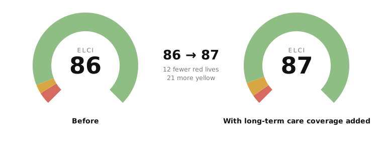
We want to be plain about epistemics here: these cause labels are diagnostic heuristics applied to simulated outcomes, not causal proofs. They are ordered so that the deeper origin wins (a late care bill that merely tips over a plan already bled dry by an early crash is labeled a sequence failure, not a care failure), and they are honest about their remainder. They exist to point your attention at the right lever: more savings, survivor income protection, a different allocation or spending policy, or long-term-care planning.
From a thousand verdicts to one score
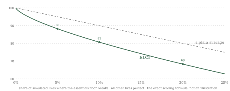
Each graded life is converted to a loss: zero for a fully funded life, small for a funded life that missed its legacy goal, larger for shallow and deep squeezes, total for red. The score then aggregates these losses with a downside-weighted mean: bad outcomes count more than proportionally, so the aggregate behaves the way a prudent person weighs risk. Two properties of this aggregation were non-negotiable in its design. First, no cliffs: the score is a smooth function of the outcome mix, so a tiny change in inputs never produces a jarring jump. Second, no saturation: every additional ruined life keeps costing points, because a score that stops responding once things are bad enough would hide exactly the deterioration a planner most needs to see.
The top of the range works differently. Among plans whose risk picture is already strong, the discrete grades stop discriminating: many safe plans are "all green." So the upper band of the score is allocated by average lived comfort quality, the information inside the green months that the grades discard. A plan that is bulletproof but only ever sustains the sacrifice floor scores high; a plan that is equally safe and also delivers the full discretionary target every month scores higher. Comfort can only allocate headroom above a strong risk result; it can never rescue a risky plan, and no run of luxurious months offsets a meaningful chance of ruin.
The result reads naturally. Scores in the 90s mean the bad tail is thin and the lived experience is close to the full target. The 80s mean solid funding with either modest tail risk or a plainer lived experience. Below that, the probability-weighted downside is doing real damage, and the donut and cause panels will show you exactly where.
Why the same plan always scores the same
ELCI is deterministic: the same plan inputs on the same engine version produce the identical score, every time, on every device. The 1,000 lives are drawn from a pinned random sequence, not refreshed per run, so the score is a pure function of your plan and the model, with no Monte Carlo flicker. If the number moves, something real moved: your inputs, or the model itself.
Determinism also makes comparisons honest. When you adjust a contribution, an allocation, or a spending policy, the revised plan is lived through the same 1,000 market and health histories as before. Differences between the two scores therefore reflect the plan change, not the luck of a new draw. This common-panel discipline is what makes small, real differences between plans detectable at all.
The model's view of "today" is pinned too. Market conditioning (current rates, inflation, valuations) is captured as a dated snapshot and refreshed as a deliberate act, at which point every saved plan is rescored under the new vintage. Every result is stamped with the engine version that produced it, and stale results from an older engine are never silently served as current. When we change the model, scores change visibly and all at once, not quietly and one user at a time.
What the models are checked against
The market engine is validated against the historical record from several independent angles, under a standing rule: calibrate the physics, then check the outcomes, and never tune a parameter directly to a headline result like the score itself. Its long-run return levels, volatilities, skew, and the degree of long-horizon mean reversion are held against a century-plus of US and international equity, bond, and inflation data. Its regime behavior is checked for realistic occupancy and persistence: how often crises and inflationary episodes occur and how long they last. Its simulated retirement-ruin rates are compared against historical block-bootstrap resampling and the published safe-withdrawal literature, on matched footing, meaning model paths are started from the same historical conditions that produced those references.
Two further checks probe the part that matters most for a conditioned score: does the model respond correctly to starting conditions? Backtests initialize the engine at each historical start year's actual state and ask where the realized decade landed within the model's predicted distribution; a well-calibrated model should be surprised at the historically correct rate, neither complacent about a 2000-style expensive start nor paranoid about a cheap one. And stress reproduction asks whether the model's named mechanisms generate the episodes that break retirements at their historical depth, including the 1970s bond-and-stock crush and deep deflationary crashes.
The health engine is calibrated against public epidemiological anchors: Social Security cohort life tables, published active-life-expectancy and disability-prevalence studies, dementia incidence and lifetime-risk estimates, mortality gradients by health state, and long-term-care utilization statistics. It is scored not only on cumulative outcomes (does the right fraction of lives reach 90, need facility care, ever develop dementia) but also on transition flows, because a model can hit every lifetime total while churning between states at unrealistic rates underneath. Finally, the spending engine itself is pinned by a regression suite of locked reference outputs, so a refactor that moves a covered scenario by a dollar is caught before it ships.
What the score cannot tell you
Sampling noise is real. With 1,000 lives, the score carries roughly a point of statistical noise near the top of the scale, so treat differences of a couple of points between plans as ties. The common-panel design makes comparisons sharper than independent draws would be, but it does not make two-point gaps meaningful. Use the score to separate genuinely different plans and to watch for material moves, not to chase single points.
All of this rests on one historical record. There is only one twentieth century to calibrate against, and some of the scenarios that matter most, such as multi-decade inflation regimes and depression-scale collapses, have only a handful of historical examples. The model represents these tails deliberately, but their frequencies are judgments disciplined by sparse data, not measured facts, and the long-horizon backtests that would settle them have very few independent windows to offer. The conditioned view of today is also a dated snapshot; between refreshes, the market moves and the score's "today" does not.
The simulation simplifies where honesty requires saying so. Long-term care beyond any insurance in the plan is self-insured and the costs are harsh by design; a red life in this model means the plan's parameters were exhausted, and the model does not assume family rescue, Medicaid navigation, or home equity extraction will save it. State income tax is currently a simplified flat treatment rather than a full 50-state model. The health engine's finest-grained old-age behavior carries wider uncertainty than its mid-retirement behavior. And no element of the model predicts you: divorce, family support, a late-career windfall, a move abroad, or a change of heart about what retirement is for are all outside it.
Finally, the cause labels are explanations of simulated outcomes, not prophecies, and the score is a measure of a plan under a model, not a probability handed down from anywhere. We believe it is a substantially more truthful instrument than a success rate. It is still an instrument, and the right way to use it is the way an engineer uses one: read it, understand what it is sensitive to, and look at the underlying lives when a result surprises you.